
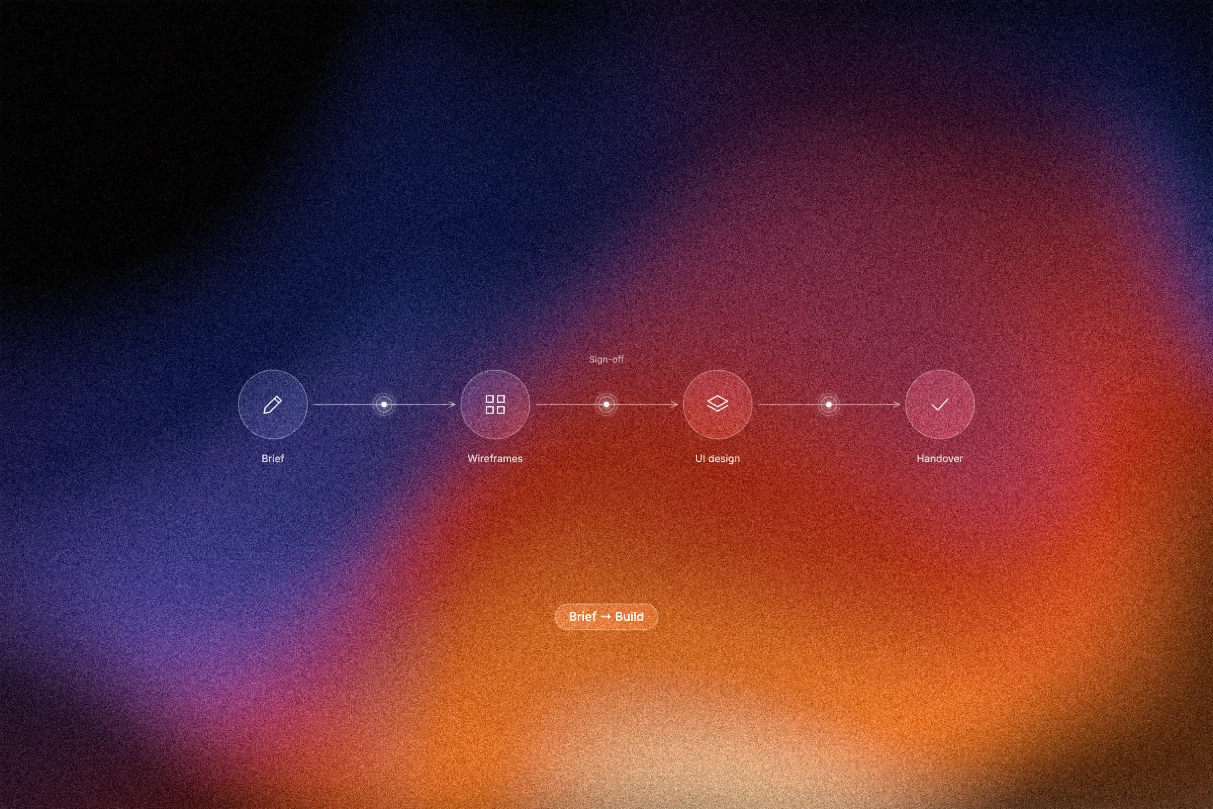
Most website redesigns do not fail in the design. They fail in the brief that came before it. When a UK business sets out to commission ui/ux design, the temptation is to lead with a moodboard, a competitor's homepage and a firm opinion about button colours. What is usually missing is the harder material: which decisions the design has to support, which artefacts the agency will actually produce, and where the client signs off.
This post treats a ui/ux design engagement as a defined sequence of deliverables rather than an open-ended creative conversation. We will examine why the brief, not the moodboard, decides the outcome, and what belongs in that brief versus what should wait. From there we will work through a practical artefact sequence: user flows, wireframes, a clickable prototype and a UI system. Each section explains what the artefact is for, what it should contain, and what you are reviewing when it arrives. We will also cover where review points sit and what you sign off at each, how to settle ownership, access and upkeep before work starts, and how public-sector design practice translates to a private-sector business site. We finish with what to do before you send the brief.
Why the brief, not the moodboard, decides the outcome
You are past the UX-versus-UI question, so this is the buying decision: what to ask for, what will arrive, and where you approve it. In our experience, briefs that produce good work specify decisions before style. Many arrive over-specified on colour, typefaces and hero imagery, and under-specified on navigation, content priority, form behaviour and error states. No published source establishes that as a UK norm; treat it as studio observation.
A vague brief transfers risk to you. The studio infers decisions, you review artwork instead of behaviour, and revision rounds are spent on questions that belonged in week one. The Brief That Wastes Your Budget Before Work Even Starts sets out that cost.
Buy four deliverables, each with a named review point: user flows, wireframes, a clickable prototype and a UI system. Treat this as our recommended sequence, not a published standard. We cite the GOV.UK Service Manual, GOV.UK Design System, NHS digital service manual and GDS Service Standard commentary for vocabulary and structure; all describe public services, not benchmarks for a private business website.
What belongs in a ui/ux design brief, and what does not belong yet
A brief that holds up under review does five things. State the objective and its measure: one sentence on the business goal, plus the number you will judge it by, such as qualified enquiries or completed checkouts, agreed before design starts. Without a measure, every review becomes opinion. Name audiences and rank their jobs by volume and prior knowledge; this is the raw material for user flows. Define scope in site terms: templates, CMS (Webflow or another system), breakpoints and languages, not a screen count. Specify decisions: navigation, content priority per template, form behaviour and validation, empty and error states, and an accessibility target such as WCAG 2.2 AA. Pair this list with a two-column graphic of brief inputs against decisions to specify, so you can check your draft at a glance. Leave visual treatment out; palette and typefaces belong to the UI system. GOV.UK frames design as naming, structuring and scoping before prototyping and patterns, useful order. Name a decision-maker and an escalation path. For agency selection, see questions to ask any agency before you sign a UX brief.
A workable artefact sequence, and why it is a recommendation
The brief fixes the decisions; the artefact sequence tests them in the cheapest order. Each artefact answers the question the next depends on, so jumping to high-fidelity screens produces polish on unexamined assumptions about how people move through the site.
Those four artefacts, user flows, wireframes, a clickable prototype and a UI system, each carry a named review gate, described in full below.
No UK source defines this as a required order. A recommended sequence drawn from practice; the gates come from studio experience because published UK guidance addresses design standards, not client sign-off.
Keep the last artefact live. GDS describes reimagining the Service Standard from a static, assessment-led model into a living system that supports the whole life cycle. Treat a UI system as an operating asset, not a filed PDF. A custom on-brand diagram should show the four artefacts in sequence with gates marked. For the wider logic of order, see Den rigtige rækkefølge fra brief til lancering.
User flows: the path before the page
Flows answer what a page list cannot: how someone arrives, decides and finishes.
A user flow diagrams routes for each top task, from entry points (search, paid ads, email, internal links) through decision branches to dead ends. Check three things: every top task has a path ending in the intended outcome; no path depends on content the client cannot supply; no branch sends users outside agreed scope. GDS notes whole journeys cut across boundaries and are rarely linear, so scope needs a deliberately chosen lens (Five lessons from scoping a whole user journey).
This makes UX designing testable. A flow can be reviewed in a meeting with no visual design attached, the cheapest and clearest point to catch structural disagreement. Ask one client person to name the decision each node encodes. If the answer stalls, the flow is wishful thinking, not a working path.
The common failure is drawing flows after the page list, baking layout assumptions into information architecture and making later changes expensive. Structure is rarely a back-office concern, as brugeroplevelse er ikke en detalje argues.
Wireframes: hierarchy and states, not decoration
With the paths agreed, the next artefact turns each node into a layout. A wireframe is a low-fidelity layout for every template, showing content hierarchy, navigation, primary and secondary calls to action, and states such as empty, error and loading. It is usually greyscale and deliberately unstyled.
Check that hierarchy follows the top tasks ranked in the brief, the primary action is unmistakable on every template, and realistic content lengths fit without breaking the layout. If templates depend on a CMS, agree early which patterns it supports; this comparison of Webflow and WordPress explains why that choice affects what is easy to build.
Wireframes are where structure is cheapest to change. Resist debating colour, imagery and type here. That belongs to the UI system, and moving it forward typically costs another round of work.
Ask for annotated wireframes with rationale noted, so the reasoning survives after the project ends.
Review question: does each wireframe trace back to a flow, and does the client know what content and assets they owe at this gate?
Clickable prototype: testing the journey before it is built
Once wireframes settle hierarchy, link them into a clickable prototype: screens that behave like the real primary journeys, built for testing rather than presentation. Perfection here wastes budget. Build from a maintained toolkit, not one-off screens. The GOV.UK Design System covers setup for prototyping and production, with styles, components and patterns, a reasonable marker of what the prototype should reuse. Test the top tasks with a small group of real users, the exact number depends on the task variety and budget; agree it in the brief. Watch where they hesitate or abandon, then fix the flow before the UI system locks decisions in. At review, ask which assumptions the test falsified and what changed. Without recorded findings it is a demo, not a decision gate. Finally, prevent the prototype quietly becoming the build: agree in the brief that it is a testing artefact and production work uses the UI system.
The UI system: the artefact you keep, not the PDF you file
With the prototype tested, the last artefact is the one that outlives the project. The UI system delivers the visual and interaction layer as reusable components: type scale, colour, spacing, interactive states, form fields, buttons, cards and navigation patterns. This is where ui/ux design stops being a set of screens and becomes an operating asset, the same logic behind Scalable Brand Components: The Architecture of a Real System.
In our experience, a PDF style guide starts degrading the moment it is exported, it cannot version itself or track what was built. The NHS digital service manual states its design system examples come with code so teams can make prototypes or build a live service, and the system is versioned, at version 10 with an update guide. The GOV.UK Design System covers styles, components and patterns for both prototyping and production, showing a maintained component library as normal practice.
At handover, ask for components in Webflow or your CMS, naming conventions, usage docs and an update route. Test it: could someone outside the project add a page using only the system, without inventing a new button? If not, you bought screens, not a system.
Where the review points sit and what you sign off at each
The UI system closes the artefact sequence, but only if approval is structured. Four gates make that structure explicit.
Gate one, flows: approve that paths and information architecture cover every scoped task, and that no route depends on content or capability the client cannot supply.
Gate two, wireframes: approve hierarchy, states and content requirements for each template, and name who on the client side supplies copy, imagery and data.
Gate three, prototype: approve the tested journey. Record test findings and resulting changes beside the sign-off, not in a verbal summary.
Gate four, UI system: approve the component set, interactive states and accessibility behaviour. Confirm handover works in the real production environment, not only in the design file.
Put a date and named approver on each gate in the contract. Keep a decision log and agree how feedback is submitted. Published UK guidance covers standards, not client sign-off, so present these gates as studio practice. Open-ended review loops, in our experience, are the most common cause of scope creep on design work. Four defined gates are the practical defence, and our five questions to ask before signing anything cover the buyer-side checks.
Settle ownership, access and upkeep before work starts
Gates only hold if the contract says what happens after them. Settle four questions before work starts.
Ownership and licensing. Who owns the design files and components, and how are licensed fonts and imagery transferred? No published UK source sets a default, so make it an explicit contract term.
Where the system lives. Production environment, design-tool library, or both, and who keeps them in step? A library that lives only in the design tool drifts from the built site within months, in our experience.
Maintenance. Who updates components when the brand, the CMS or accessibility expectations move, and how are releases versioned? The NHS design system, now at version 10 with its own update guide, shows a library treated as a maintained product.
Access and continuity. Repository access, CMS admin rights, design-tool seats and documentation should sit with the client, with the position on termination stated.
Ask for three clauses: a defined artefact list per stage, acceptance criteria for each, and a required handover format, so the gates above are enforceable.
Translating public-sector design practice to a business website
With ownership settled, where does the model come from? The strongest published UK references, the GOV.UK Design System and the NHS digital service manual, cover government and NHS services, not SMEs or e-commerce sites. Use them for vocabulary, structure and evidence about maintained component libraries, not as comparators.
What transfers: named design stages, shared component libraries that ship with code, accessibility expectations built into components, and systems versioned and updated rather than republished as PDFs. What does not: a public service standard's assessment process, remit and reporting obligations. A business site has a different audience, a different success measure and no external assessor.
GDS's 2026 shift from a static, assessment-led model to a living system supporting the whole service life cycle is still instructive. Treat a business site the same way across years of content, campaigns and product changes.
Aarland, a Danish studio offering website and webshop development, branding, UX/UI design, prototyping and wireframing, can run exactly this sequence as an external partner. Judge the fit using the criteria in our guide to local design bureaux in Aarhus.
What to do before you send the brief
With that translation in mind, four actions prepare a brief that stands up to scrutiny.
Specify decisions. State the business objective and its measure, audiences with ranked top tasks, scope in site terms, and the behaviours you need resolved: navigation, form validation, empty and error states.
Buy artefacts, not deliverables-in-the-abstract. Contract each artefact with a named review gate, a date and an approver.
Demand a working system. Insist the UI system is delivered as a live, versioned component library.
Settle the commercial terms. Agree ownership, access and a maintenance route before signing.
Send that brief and you are commissioning decisions, not decoration.
Conclusion
Taken together, the brief, the artefact sequence and the four review gates turn design from a one-off commission into a living system. Translated from public-sector practice, this supports years of content, campaigns and product change.
The next step is straightforward: use the four actions above to draft your brief, then judge potential partners against the criteria in Aarland's guide to local design bureaux in Aarhus.