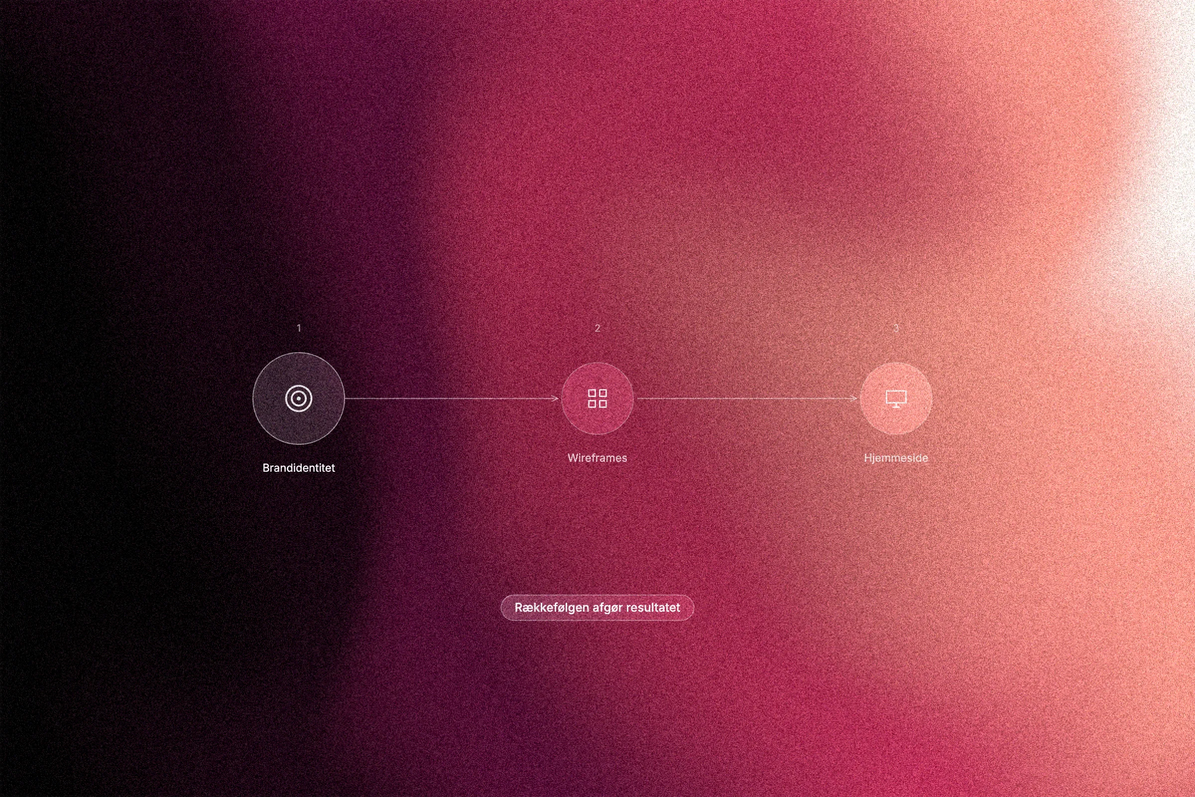
Most businesses make the same mistake. They book a web developer, write a brief and expect a result that lasts. What they do not count on are the expensive revision rounds that inevitably follow when design decisions are made without a strategic foundation underneath.
The problem is rarely the designer. The problem is the order.
Brand identity is not something you add afterwards to make the site feel "more consistent". It is the foundation everything else rests on. Even so, most businesses skip this step and end up with a website that points in several directions at once, visually and in what it says.
In this article you will learn what a strong brand identity actually contains, how brand guidelines work as a management tool rather than just a design document, and why Danish businesses have a strategic starting point they rarely use to the full. Above all, you will understand when the brand identity is actually locked, and what the right order from brief to launch looks like in practice.
When design starts without a foundation
Most businesses start a website project by asking the agency the same things: which colours should we use, what should the site contain, and which features do we need? It is an understandable approach, but it skips a crucial step: defining what the brand actually stands for before a single design decision is made.
The consequence is predictable. When the brand identity has not been defined in advance, the design process becomes a series of educated guesses. Colours are chosen on gut feeling. Typography is chosen for what "looks good". And messages are written along the way instead of growing out of a considered strategy. That creates revision rounds, not because the agency lacks skills, but because the input was insufficient from the start. Research published in the Journal of Business Research supports the view that consistent brand identity requires a clear definition before implementation, based on data from 302 organisations.
Every extra revision layer costs time, money and the momentum that matters so much early on. And the finished website still ends up feeling inconsistent, because the many adjustments never had a shared anchor to navigate by.
A website is not a product in itself. It is a visual and verbal translation of something that has to exist before it. If there is nothing to translate from, you are building on sand.
Branding is not decoration, it is the product
The reason the design goes wrong runs deeper than process. It is about what branding actually is.
Since the 1950s, consumers have increasingly bought products for their symbolic meaning and emotional resonance rather than pure function. You do not just buy a watch; you buy an identity. You do not just choose a bank; you choose a sense of belonging. That behaviour is not superficial; it is structural and well documented.

B. Joseph Pine II and James H. Gilmore described in Harvard Business Review back in 1998 how the experience economy was replacing the service economy as the main arena of competition. Consumers no longer just seek a service; they seek an experience with meaning.
Today the consequence is clear: in most industries the product or service itself has become interchangeable. Two software products, two accounting firms, two web studios can deliver technically comparable results. Differentiation does not happen through the feature list, but through brand identity: the overall sense of what the business stands for, what it promises and who it speaks to.
The same principle applies to B2B. Decision-makers justify the choice afterwards with price and specifications, but the choice itself is often made on trust and recognition. You partner with someone you believe in and see yourself in.
The brand is not the wrapping around the product. It is the offer itself.
What a brand identity contains in practice
Once the brand has become the main competitive factor, the natural question is what a brand identity actually consists of when you have to work with it.
Brand identity is the symbolic foundation that defines three things at once: who the business is, what it stands for, and how it communicates, both visually and verbally. It is not a tagline or a logo in isolation, but the sum of every deliberate choice about how the business wants to be perceived.
Core values and positioning establish what sets the business apart from the rest of the market, and what place it wants to occupy in the audience's mind. Without an explicit positioning, those choices are made anyway, just by chance.
Visual communication turns the positioning into form. It covers correct and incorrect use of the logo, a defined colour palette, typography and the imagery used consistently across every channel. These elements are not decorative; they are visual communication that carries the identity into every point of contact.
Tone of voice and messaging hierarchy define how the brand speaks: which messages are primary, which register is used, and which phrases are consistently avoided. A brand that changes tone depending on who writes the text gradually and quietly loses credibility.
Brand guidelines bring all these layers together in one working document. The purpose is concrete: designers, agencies and internal teams should be able to work from it without guessing or interpreting. That is the difference between a brand foundation and a folder of loose files.
Brand guidelines as a management tool, not just a design document
Brand guidelines reduce what you might call decision friction: the constant stream of small but time-consuming choices that otherwise arise during any design project. Should the button be rounded or sharp? Should the tone be direct or formal? With guidelines in place, the answer has already been given, and the design team can spend its energy on execution instead of clarification.
That speeds up website production considerably. When designers work from a fixed foundation, the revision rounds that are about direction rather than quality fall away.
The most expensive revision phase is the one without a precise vocabulary. It is the one where the client says "it just doesn't feel quite like us" without being able to say what is missing. That kind of feedback is not invalid; it is a symptom that the brand identity was never defined explicitly. Guidelines give both sides a shared reference point and replace gut feeling with criteria.
From a project management perspective, a well-defined brand foundation is risk reduction, not a creative constraint. It reduces scope creep, shortens approval processes and makes sure every stakeholder works towards the same goal.
For small and medium-sized businesses with limited budgets, this matters even more. Many smaller companies work with changing freelancers or agencies over time. Without a solid brand framework as a reference, visual communication gradually loses consistency, and that costs credibility that is far more expensive to rebuild than to keep.
Danish design values give a strategic head start
Danish design carries a strong cultural heritage: simplicity, functionality and a fundamental honesty in materials and form. Internationally, these principles are associated with quality, sustainability and trustworthiness, and that is a real competitive advantage. But the advantage is not activated automatically. It requires the values to be deliberately anchored in the brand identity before a single design element is used.

A Danish business that builds its website without defining its relationship to these values explicitly cannot expect them to show in the result. The cultural references are not self-evident in typography, colour palette or imagery. Visual communication and tone of voice have to translate them actively; otherwise they remain potential rather than positioning.
The same goes for softer cultural values such as flat hierarchies, openness and social responsibility. They can set a Danish business apart in international markets, but only if they are written into the brand strategy and reflected consistently in its communication.
International growth makes this clearer than anything else. When a business tries to adapt its expression to new markets without a locked core identity, it risks diluting that identity: the brand tries to appeal to everyone and ends up meaning nothing to anyone. A well-defined brand foundation makes it possible to adapt to new markets without losing authenticity.
When is the brand identity actually locked?
Defining your brand identity is one thing. Knowing when it is clear enough to build on is another.
A practical starting point is four questions the business must be able to answer unambiguously: Who are we? Who are we talking to? What is our promise? And how does it look and sound? If you cannot answer all four clearly, the foundation is not stable enough for production.
Concrete success criteria for a locked brand identity include:
An approved positioning with a clear distinction from competitors
A defined visual communication package: logo, colour palette, typography and imagery
A validated tone of voice with an explicit position on register and language
A single brand guidelines document that external partners can work from directly
Warning signs that the identity is not locked enough: you cannot explain the colour choice strategically, you are unsure whether communication should be formal or informal, and the audience is defined so broadly that it is not really defined at all.
Depending on the size and complexity of the business, a dedicated brand strategy and identity phase is typically an investment of a few weeks, time that pays for itself in the absence of expensive revision rounds.
At Aarland, the branding phase is an integrated part of the website process. It is not an extra layer, but the condition for the design that follows being built right from the first wireframe.
The right order from brief to launch
Once the brand identity is locked, the process is clear. These are the five steps, in the order they should be carried out:
Step 1: Brand strategy and positioning. Map the core values, define the audience precisely and analyse the competitive landscape. The aim is to establish the position the business should occupy in the market's mind before a single design decision is made.
Step 2: Visual identity and brand guidelines. Translate the strategy into a visual system: logo, colour palette, typography and imagery, gathered in one set of brand guidelines as the shared reference for everyone who works with the brand from then on.
Step 3: Tone of voice and content strategy. Define the message hierarchy, language guidelines and the core narrative that will carry the communication. Tone of voice is not soft marketing; it is the voice that creates recognition across every point of contact.
Step 4: Wireframing and UX architecture. Only now is the structure of the website drawn. With the brand identity as input, the architecture and user flows reflect the business's priorities and communication logic, instead of reasoning backwards from a blank canvas.
Step 5: Website design and development. The complete brand foundation is translated into a digital experience with consistency from the homepage to the checkout or contact form.
Conclusion: investing in the order pays off
With the order in place, the logic is clear: each step builds on a stable foundation instead of compensating for a missing one.
Skipping the brand identity phase does not save time. It is a deferred bill, and it grows with every design decision made on gut feeling, because unclear input guarantees unclear output.
A locked brand identity changes the dynamic fundamentally. Designers, developers and copywriters work from the same precise foundation and do not have to validate the direction along the way. Fewer guesses mean fewer corrections, and fewer corrections mean lower total costs and a shorter time to launch.
The principle is simple: first map what your business actually stands for. Then let the design translate it, not define it.
Planning a new website or a rebrand? Read more about brand identity at Aarland, and how the right order protects both budget and result from day one.