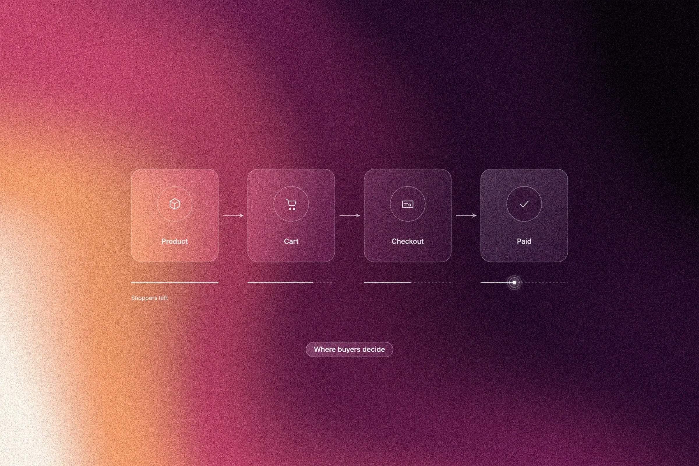
Most ecommerce web design budgets are spent in the wrong place. The homepage gets the attention, the redesign concepts and the internal debate. Revenue is decided elsewhere.
Conversion happens, or fails, on the templates where shoppers hesitate. Product page hierarchy decides what they see first. Spec and sizing information decides whether they trust the fit. Delivery costs revealed late in checkout can undo every step before it. Payment options and error states quietly filter out buyers who were ready to pay.
This article covers the six decisions that shape conversion, and what to test first.
Why ecommerce web design budgets land on the homepage
Budgets land on the homepage because it is the first page stakeholders review. Many shoppers who end up paying never see it. Ads, search results and shared links send them straight to a product or category page.
Separate the two jobs. The homepage carries positioning, brand proof and the fastest route into categories. The money pages (product page, cart, checkout and confirmation) carry the buying decision. This is our view from project work rather than a published benchmark, so check it in your own analytics: compare the landing pages of all sessions with the landing pages of sessions that convert.
A misdirected project is easy to spot in the budget. Most design hours go into homepage layouts, while checkout keeps the platform's default styling and default copy.
Where shoppers hesitate: the six decisions that decide conversion
Shoppers hesitate at six points: fit, total cost, delivery and returns, payment trust, form errors and whether the shop is worth the risk. Each one has a design owner on the money pages.
Hesitation is different from friction. Friction is an extra field or step. Hesitation is an unanswered question, such as whether the parcel arrives before Friday or who pays for a return.
The research points the same way. Baymard Institute puts the average documented cart abandonment rate at around 70 percent across 50 studies. Among US shoppers who abandoned an order, leaving aside those who were only browsing, 40 percent named extra costs such as shipping, tax and fees, 18 percent did not want to create an account and 17 percent hit errors or crashes.
Use this map when you brief the money pages:
- Fit and suitability: product page hierarchy, specs and sizing
- Total cost: price, fees and delivery shown early
- Delivery and returns: plain terms on the product page and in the cart
- Payment trust: payment methods, security cues and a clear order summary
- Form errors: inline validation and recovery paths
- Brand risk: reviews, contact details and honest policies
Product page hierarchy: what shoppers need, in what order
A good product page answers the buying questions in the order shoppers ask them. Above the fold, show the product name, price, availability, the add-to-cart button and one strong image. Keep the two or three attributes that decide the purchase in the same view, such as fabric and fit for clothing or dimensions for furniture.
Place variant selection before the add-to-cart button, and show unavailable combinations as sold out instead of hiding them. A hidden size reads as a technical fault. A greyed-out size reads as demand.
Be just as strict on price. Unit price where relevant, tax handling and mandatory fees belong on the product page, not on the payment step. Regulators are enforcing this. In the UK, the CMA's price transparency rules under the DMCC Act require mandatory charges to be part of the headline price, and in November 2025 the regulator opened eight investigations and announced warning letters to 100 businesses across 14 sectors (TLT summary).
Keep the long product story below the fold, but answer the most common objections within one scroll. On mobile, use a sticky add-to-cart bar that keeps the chosen variant, and never let a full-screen gallery bury the buy button. Test order and placement inside the existing template before proposing a rebuild.
Specs, sizing and comparison: removing the will-this-fit doubt
Shoppers buy when they can confirm the product fits their need, so specs and sizing must match the category. Clothing and footwear need measurement tables, fit notes and model reference points. Furniture needs dimensions, door and stair clearance and assembly details. Localise units, language and size conventions for each market you sell to.
Structured attributes beat prose. One consistent table for material, weight, dimensions and compatibility also feeds category filters and on-site search, so the same data works twice. EU consumer law already requires traders to state the main characteristics and the total price before a distance purchase, so clear specs are a legal floor as well as a conversion lever.
Where shoppers compare, show two or three alternatives side by side on the attributes that actually differ, inside the product page. Use media to answer questions: scale references, in-use shots, and 360-degree views or short video where movement matters.
Return reasons and pre-purchase support questions show where this fails. Repeated will-this-fit questions point to a template problem long before analytics does.
Shipping and returns: show the cost before checkout
Show delivery cost, delivery options and estimated dates on the product page and in the cart, before the shopper starts checkout. State free-delivery thresholds early, including how much is left to qualify, so the total never comes as a surprise on the last step.
Write return terms in plain language: the return window, the condition items must be in, who pays return postage and when refunds are issued. The Danish Consumer Ombudsman offers a useful model. Shoppers may handle goods the way they could in a shop, such as trying on clothes, without losing the right to return them.
To test it, move delivery cost earlier and track cart-to-checkout drop-off alongside support tickets about delivery and returns.
Payment options and checkout flow: fewer doubts, fewer steps
Show which payment methods you accept before the final step, on the product page or in the cart. List cards, local wallets such as MobilePay in Denmark, and any instalment or invoice options. If you only support some methods, say so before the shopper invests time.
Keep guest checkout next to account creation. Forcing registration before payment adds a step at the moment of highest intent.
Design the payment step deliberately:
- A broken-out total with tax and delivery, and no silent currency switch
- Security reassurance placed beside the card fields
- A short, single-column form with an order summary the shopper can see and edit
- A progress indicator that says what is left
Error states: designing the paths that break
Most checkouts handle errors badly because nobody designed them. Validate each field when the shopper leaves it, not when they press pay. If a step fails, keep everything they typed. Place each message next to its field and name the field, the problem and the fix, for example that a Danish postcode has four digits.
Declined cards need a real recovery path: retry without re-entering the order, a contact route that works, and plain wording about whether the order went through. The same applies to out-of-stock items, expired sessions and price changes mid-checkout.
Put error states in the checkout brief from day one and test them on purpose: declined cards, invalid postcodes, expired sessions and slow mobile connections. They are designed last and hit first.
What to scope first in an ecommerce design project
Scope by template, not by page count. Product page, product listing, cart, checkout, confirmation, account and error states each need their own design and test allowance.
Wireframe and prototype each template before visual design. A clickable prototype exposes hierarchy problems while they are still cheap to fix. Choose the platform early, because template and custom-field limits shape what you can test later. If you are unsure whether you need a simple webshop or a full ecommerce build, this comparison helps you decide.
Define done for each template as a list of questions it must answer. That keeps checkout from shipping half designed.
How to test money pages without a research budget
You can test what matters without a research subscription. Start with a handful of moderated sessions on the live product page and checkout, focused on the six hesitation points. Watching real shoppers pause over sizing or delivery cost reveals more than a benchmark report.
Prioritise by revenue at stake and test the template that carries the most sessions towards payment first. Track the funnel end to end: product view to add to cart, cart to checkout, checkout to payment and payment to confirmation. The biggest gap tells you which template to fix.
Use A/B tests only where traffic supports a reliable result. Below that, compare fixed periods before and after a change and allow for seasonality. Our guide on proving that a redesign worked shows how to set that up.
Every quarter, feed returns data, support tickets and on-site search queries back into the product page brief.
Treat the homepage as a brand asset
The homepage still matters, but its job is brand and navigation. Give it the tasks it does well: positioning, range credibility, trust signals and a fast route into categories. Be honest there about what you sell, where you ship, what delivery costs and how returns work.
Brand work still earns its keep through ad click-through, repeat visits and word of mouth. It cannot replace a strong product template, so check your analytics by page type before you decide where the next budget goes.
How Aarland scopes webshop templates
Aarland scopes webshops template by template, with wireframes and prototypes before visual design. We are a design studio in Aarhus, a certified Webflow partner since 2018, and we build websites and webshops in Webflow and Shopify at a fixed price. For a scoping conversation, bring what you already have: analytics, product data, return reasons and support tickets. Then the money page decisions start from facts.
Conclusion: what to do this quarter
Start with your funnel data and name the two templates losing the most shoppers. Fix those before any homepage polish. Show delivery cost and return terms on the product page and in the cart this month, because it is the cheapest change here and it addresses the most common reason shoppers leave. Add an error-state pass to the checkout brief and test real payment failures. Then set a six-week measurement plan around add to cart, checkout start and completed payment, and review it honestly.
Want a second pair of eyes on your product page and checkout? Get in touch with Aarland, and we will show you where your shoppers hesitate.