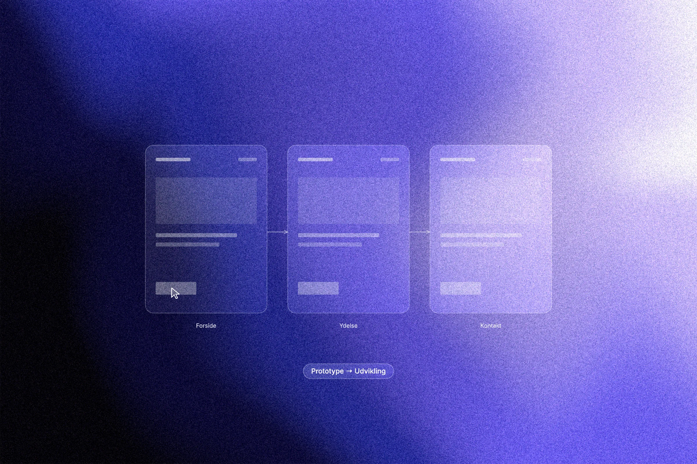
A clickable prototype should not just look good. It should prove that the important decisions have been made before development begins. Many buyers have paid for a design phase where it was hard to tell what had actually been approved. You can avoid that by treating the sitemap, the wireframes and the clickable prototype as three decision tools, each with its own approval point.
This post walks through how those deliverables fit together as a chain of decisions. We look at why the prototype is a decision tool rather than an aesthetic phase, then go through the three approval points: Are the pages and navigation right? Is the content in the right order? Can users complete their tasks without confusion? You also get a way to judge deliverables on decisions rather than looks, a checklist of what to demand before development starts, and three questions you should be able to answer yes to.
The prototype is a decision tool, not an aesthetic phase
Changes become expensive when they are debated in code instead of in structure. A prototype should not be judged on how pretty it is, but on which decisions it makes possible. Flow, navigation, content and business priorities should be cheap to reverse before anything is built. Each step has its own approval point, so risk and revision costs fall step by step instead of piling up at the end.
An error found at the prototype stage is far cheaper to fix than the same error discovered after development or launch. The argument is widespread in UX literature, but hard numbers from primary sources are scarce, so treat any figures you see as guidelines rather than documentation.
By the end of this article you should be able to ask the right questions of each deliverable and answer yes or no with a reason you can write into the agreement. That is what it takes to approve a prototype as a decision tool rather than a fuzzy phase you simply pay for.
How the three deliverables form a chain of decisions
The order is not random. The sitemap locks the structure, the wireframes lock the content priorities, and the clickable prototype locks the flow and interactions. Each deliverable builds on the one before, and if you skip a step the discussion moves up to a more expensive level.
In our experience, the sitemap typically takes about a week, wireframes two to three weeks and the clickable prototype two to three weeks. Scope, page count and the number of stakeholders all move those numbers, so use them as a guide, not a contract.
At each approval point, roles must be clear. Marketing owns content and conversion points. Sales or customer service own the real user tasks. Technical staff assess integrations. Management owns the trade-offs between them. Without that split, everyone approves everything and nobody owns anything.
In practice, approved means a written acceptance of the decisions in the deliverable, a list of items deferred to later, and an agreement on which changes belong to the next step and which trigger an extra cost. That agreement is what stops the project ending in an endless revision loop.
Approval point 1: The sitemap. Are these the right pages and the right navigation?
The sitemap is the first concrete place where you say yes or no. It shows every planned page, the hierarchy between them, how they link to each other, how many navigation levels there are and the overall URL structure. It is not a technical file but a decision document that fixes how many pages the project really includes, how deep the navigation may go, which pages are sub-pages and where the conversion points sit in the structure.
Four questions to ask
Are there pages missing that users will look for?
Are there pages without an owner or a purpose?
Does the hierarchy match the customer's path from interest to action?
Can we add new sections later without rebuilding the navigation?
The organisational benefit is that the discussion about what is in and out happens at a point where it is cheap, and where every stakeholder sees the same picture. It prevents scope creep, because additions and cuts become a shared decision rather than a late surprise during development.
The acceptance criterion is simple: you should be able to point at any page in the sitemap and explain why it exists, who it is for and how the user moves on from there. If you cannot, the sitemap is not ready for approval.
Approval point 2: Wireframes. Is the content in the right order?
With the sitemap approved, you know which pages exist. The next decision is about what meets the user on each page. That is the wireframes.
What wireframes are, and what they should decide
Wireframes are low-detail greyscale blueprints that show layout and hierarchy without colours, photos or typographic choices.
They are used to decide which elements come first on each page, where the key actions sit, how long texts, tables and forms are handled, and how much space the content actually needs. This is where you find out whether there is room for the content marketing wants to write, and whether the content that needs writing will fit. If you are considering a change of CMS later, this is also the moment to check that the platform can carry the structure the wireframes show. Our comparison of Webflow and WordPress can help.
What wireframes cannot decide
Brand expression, colour palette, typography and photographic style belong later. Mixing those discussions in now makes approval slower and more expensive, because the focus shifts from structure to taste.
Approval questions
Is the most important information at the top?
Can the user see the next step without reading the whole page?
Does marketing have content for the space available, and is there space for the content that needs to be written?
Take two to three rounds now
Wireframes are cheap to change. Take two to three revision rounds here instead of saving every objection for the prototype, where changes hit several screens at once. Each round reduces the risk of approving a structure that cannot carry the content.
Approval point 3: The clickable prototype. Can users complete their tasks?
With the wireframes agreed as the structure, the next step is to prove that the structure also works in use. The clickable prototype simulates navigation, interactions and flows without code. Fidelity can range from a rough clickable sitemap to near-final design. What matters is not pixel perfection but that someone can click through a task.
Choose the tasks to prove
Identify the three to five most important user tasks, for example complete a purchase, book an appointment, find the price or send an enquiry. Turn each task into its own clickable flow, so the prototype can be tested task by task.
Test without a UX lab
A small number of tests, typically five to seven according to common usability practice, is enough to uncover the most important problems. Measure how many complete the task, where they stop and which words they use for what they see. It needs no special facility, just a screen and an observer taking notes.
Demand the business logic too
The prototype should include pricing, terms, options, error messages, confirmations and empty states. Those are the situations where users tend to drop off, and they can be tested long before development. Without them, you are only testing the happy path.
The acceptance criterion
A test participant should be able to complete the task without asking for help. You should be able to document, with screen recordings or notes, where things went wrong and what was fixed. Only then is the prototype approved as the basis for visual design and development.
How to judge the deliverables: decisions over aesthetics
Once the prototype has been tested and you have seen where users drop off, you need a consistent way to judge the deliverables. Use a fixed frame for each one: Which decisions are at stake, who owns them, what does a change cost now compared with after development, and what happens if the decision is not made here? That frame requires a supplier who works in a structured way. At an established design studio, fixed approval points are part of the process, because it is cheaper to decide in the prototype than in the code.
Separate structure from expression in the meeting. Colours, images and typography should not be able to block the approval of a flow. Put aesthetic discussions on a separate track so they do not delay the decisions that steer development. Brand guidelines belong on the table once the structure is approved, not the other way round.
Write the approval down immediately, so the project keeps its audit trail when it changes hands.
Watch for red flags: no defined approval points, a prototype that is mostly pretty screens without clickable flows, and phrases like "we'll figure it out in development". That is typically where the budget slips.
Use short demos instead of long documents. A short demo where the decision-maker clicks through a task themselves produces better approvals than reviewing pages of screenshots, because the person experiences the flow instead of reading about it. Short demo, sharp decision, written down straight away.
Checklist: what to demand before development starts
Once you have clicked through a task yourself, the requirements should be written into the agreement before the first development invoice is paid. All three deliverables should have defined approval points and an agreed number of revision rounds.
Prepare each approval meeting the day before: read the deliverable, bring the three most important user tasks, and be ready to answer yes or no with a reason. Do not save comments for later; it postpones the decision and makes the change more expensive.
Test the prototype as a user, not as an owner. Go through it as someone who has never seen the solution before, and note where you hesitated. Your own confusion is often the best indicator of where a real user will drop off.
Ask for reasons and measures: Why does this section sit here, which task does it solve, and how will we later see whether it works? Answers that point to user behaviour and conversion are stronger than answers that point to personal preference.
Choose a supplier on process, not style. At a Danish design studio like Aarland, a certified Webflow partner working with UX/UI design, wireframing and prototyping, structured approval points and close client contact should carry real weight in the choice.
Conclusion: three questions you should be able to answer yes to
The three approval points boil down to three yes/no questions:
Structure: Are the pages and navigation right, and can the structure grow without being rebuilt?
Content: Is the content prioritised in the order users need it?
Flow: Can test participants complete the most important tasks without help?
If the answer is yes three times, the foundation for development is in place.
Treat the three approval points as a gate in your agreement, not as a polite update along the way. Write the requirements in before the first development invoice is paid. Otherwise you are in practice approving a phase you cannot measure.
Only order development on a flow you have clicked through and understood yourself. The half hour it takes to test the prototype is the cheapest half hour in the entire project.